*Affiliate links noted in italics and provided for your convenience. For more info, see my full disclosure here.
Well, Friends, I’m so happy to report that we have finally crossed the finish line in the playroom remodel and are 100% done! Cue all the celebratory singing, dancing, and confetti!
You may remember, we started this project back in the spring, but then Jeremy and I came down with the flu and had to halt progress for a while. I made a big push to finish over the summer, but what I thought was only 10 percent of the work remaining ended up being more like 20 or 30 percent. Ugh! Work pretty much stopped the past couple months because of travel and enjoying family time with the kids while they were off for the summer. But, finally, all the loose ends are tied up and we are DONE! Yay!
Catch up on the previous posts here! Playroom Before, Demo, Construction, Finishing Touch Progress
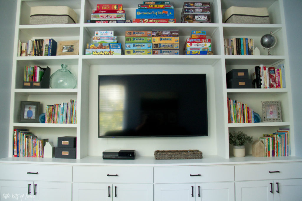
Come on in, I’ll show you around! The main piece of the new playroom design is this massive wall to wall, floor to ceiling built in unit we designed and constructed. The previous playroom layout was severely lacking storage space, so we wanted lots of shelves to store books and games, plus closed storage for all.the.toys. I’m happy to report that it is a total game changer and has been working out amazingly!
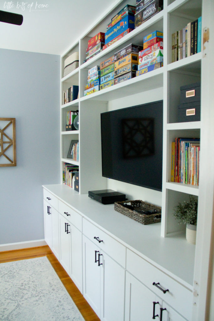
And, of course, the other huge functional change to this room besides having loads of storage is that we now have a spot for a big honkin TV! Jeremy loves unwinding at night by playing video games, so I wanted him to have a bigger screen so he could actually see. Before, he was pulling up a chair and sitting directly in front of our little living room TV so he could read the text. Poor guy! We added a couch across from the built in, and now he can comfortably recline and play his games like a king. Haha!
I actually didn’t anticipate how much the whole family would use the TV in this room! We barely use the living room TV anymore! We’ve always had small TVs, so we didn’t know what we were missing out on! We love piling on the couch together and having movie nights in here!
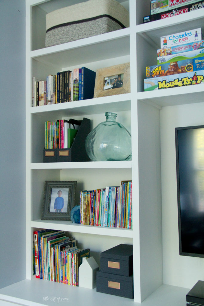
I have to give Jeremy a MASSIVE shout out for the built in construction! He took my sketches and hours of talking his ears off about the design and made it come to life. He even worked with a wife who is incredibly particular and made sure to make all the shelves evenly spaced. That was a fun math problem…
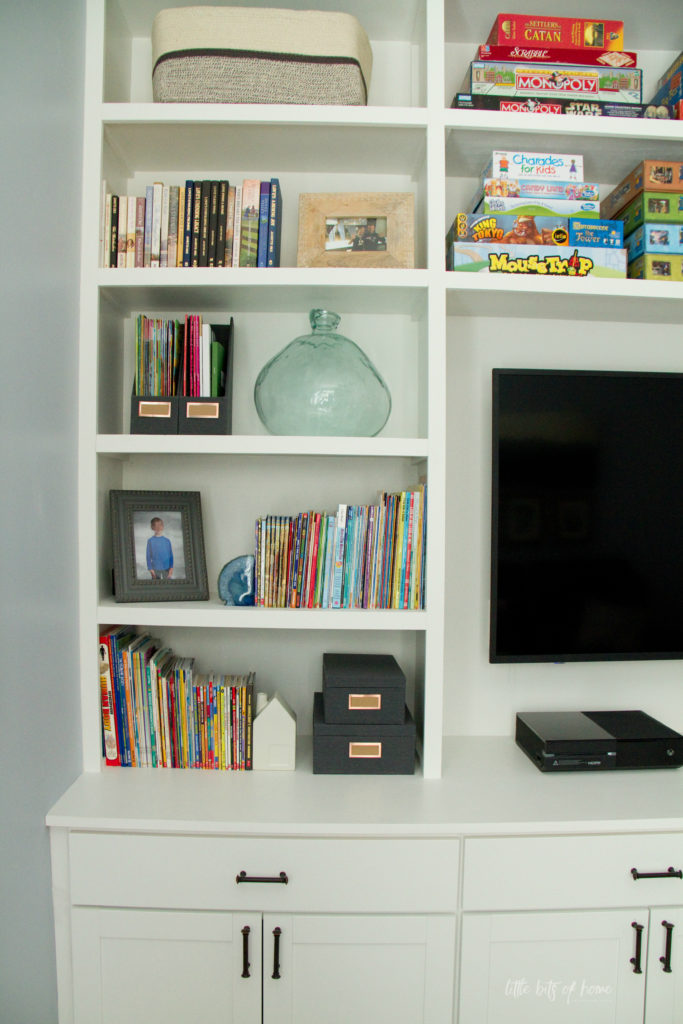
I especially love the shelves above the TV! We have a bazillion board games and really wanted a place where we could store them, but still access them easily. They were previously piled on the shelf in the closet all the way up to the ceiling! We were planning to put a divider in the middle of the shelves above the TV, but made a last minute call to leave the shelves super long. The lack of dividers give us much more space and flexibility since board game boxes are so long and bulky.
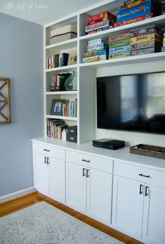
The built in is literally 10′ long, so even with a wide angle lens (hence the slight curved look of this photo) I couldn’t get it all into one photo. But, hopefully this gives you the idea! The bottom of the built in is made up of four base cabinet units from Lowe’s. I was very excited that these were already painted!
We made the counter out of 3/4″ plywood finished off with edge banding. I painted the shelves and counter with paint I had color matched to the white on the cabinets. To color match, I removed a drawer and took it to Sherwin-Williams. They were able to mix my paint in the exact shade of white so it all matched.
Here’s the other side of the built in, looking toward the door. I used large baskets I found on clearance at The Container Store to store things like game pieces and party supplies. I love this shallow basket tray from World Market for corralling the remotes.
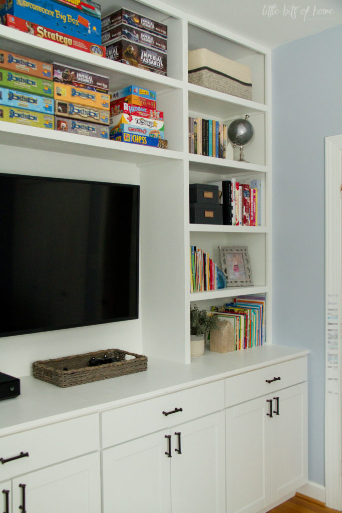
I used photo boxes to store smaller puzzles and card games. Mine are from the Hearth and Hand line at Target. They are on clearance right now, so they may be hard to find, but I did find similar boxes in more colors here.
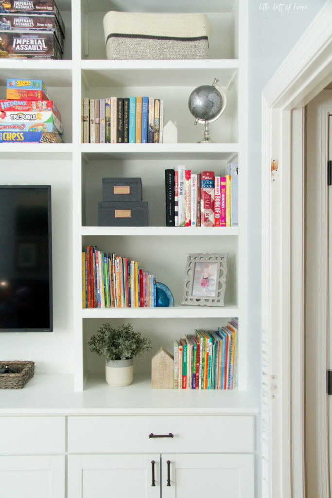
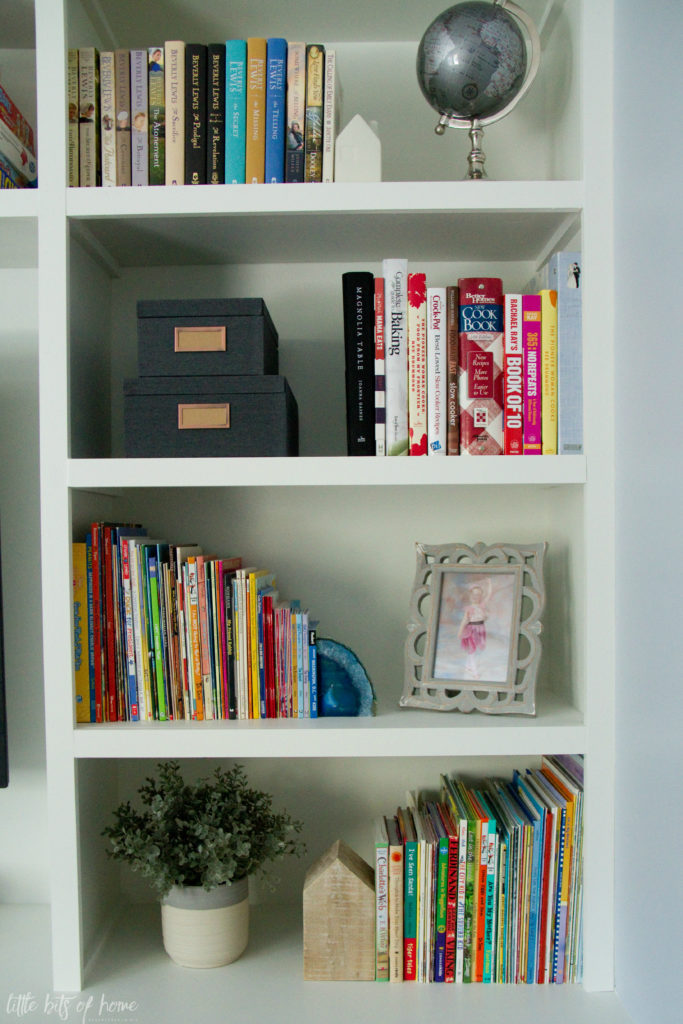
I didn’t overly decorate the shelves because I wanted as much storage space as possible. But, I did add a few accessories that I love! Per my kids request, I added a globe which they love! I found it at Home Goods on the cheap! I also have a love affair with little houses, so there are a couple little houses scattered around the shelves. The adorable white houses were a gift from a friend (Thanks, Julie!!!) and the wooden house is an old Target clearance find.
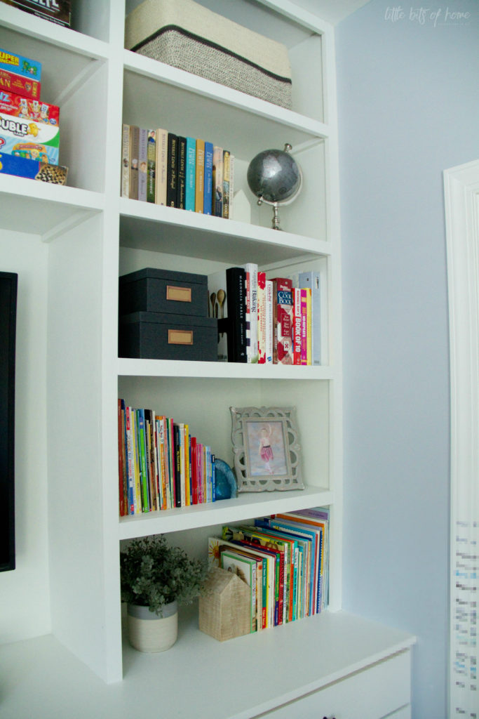
My kids love rocks, so they went bananas over these agate bookends. Anyone else’s kids obsessed with rocks? If you only knew how many rocks I find in the bottom of their backpacks! Haha!
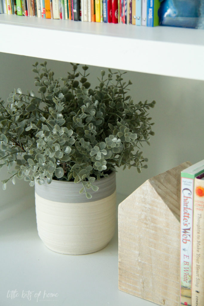
I love this plant I found at Kirkland’s! It’s the perfect color!
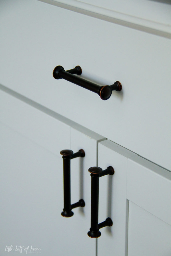
And, a quick close up of the hardware we chose. It’s just in stock hardware from Lowe’s. We really like it, but be careful because the colors varied a lot. We had to exchange several of them because they were too dark or didn’t have as much distressing as the others, so didn’t match. 
Whew, you still with me? 
From this angle, you can also see the new paint color, artwork, and rug! The paint is Sherwin-Williams Upward and is a nice blue/gray color. The rug is from Wayfair, but no longer available. I did find what appears to be the identical rug under a different name on Amazon , though. The rug has held up great so far and I love that it is patterned so will be better at hiding any spots.
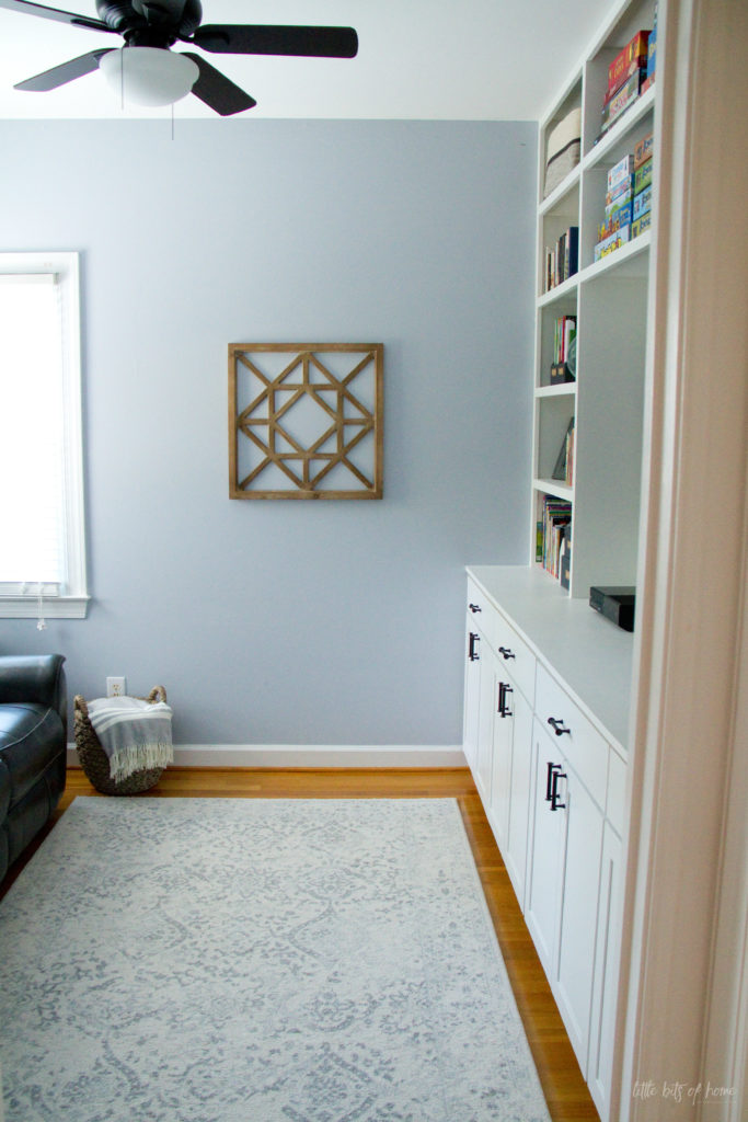
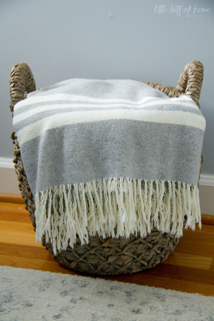
I searched long and hard for the perfect basket to hold blankets and finally found the perfect one at World Market! I love the gray wash and that it coordinates with the remote basket! The blanket was a TJ Maxx find.
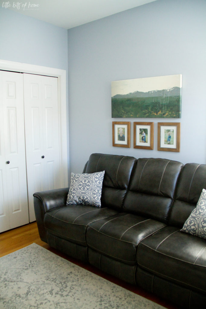
Swinging to the other side of the room, you’ll spot our new couch! It is so NOT what I had in mind. I was thinking a stylish gray lower profile couch would be perfect. But, then we sat on this bad boy at Rooms to Go and it suckered us with its comfy reclining seats and adjustable head cushions. Haha! It’s not trendy, but it is so comfy!
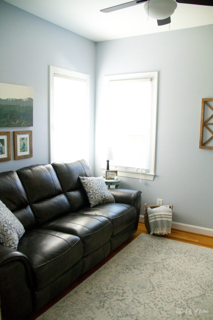
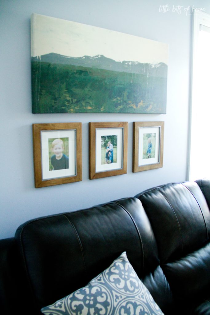
The wall above the couch was so tricky to decorate because of the corner windows. I was planning to hang curtains, but they looked funny with the position of the couch, so we decided to do without curtains and just replaced the shades with 2″ blinds. We still had to figure out what to do with the left side of the wall, though. We ended up creating height by mixing artwork and framed family photos to balance out the height of the windows.
The mountains are my happy place, so when I saw this artwork by Sara from Twelve on Main, I fell hard for it! I love how the colors in the painting look with the wall color and loved that I was able to order the exact size I needed.
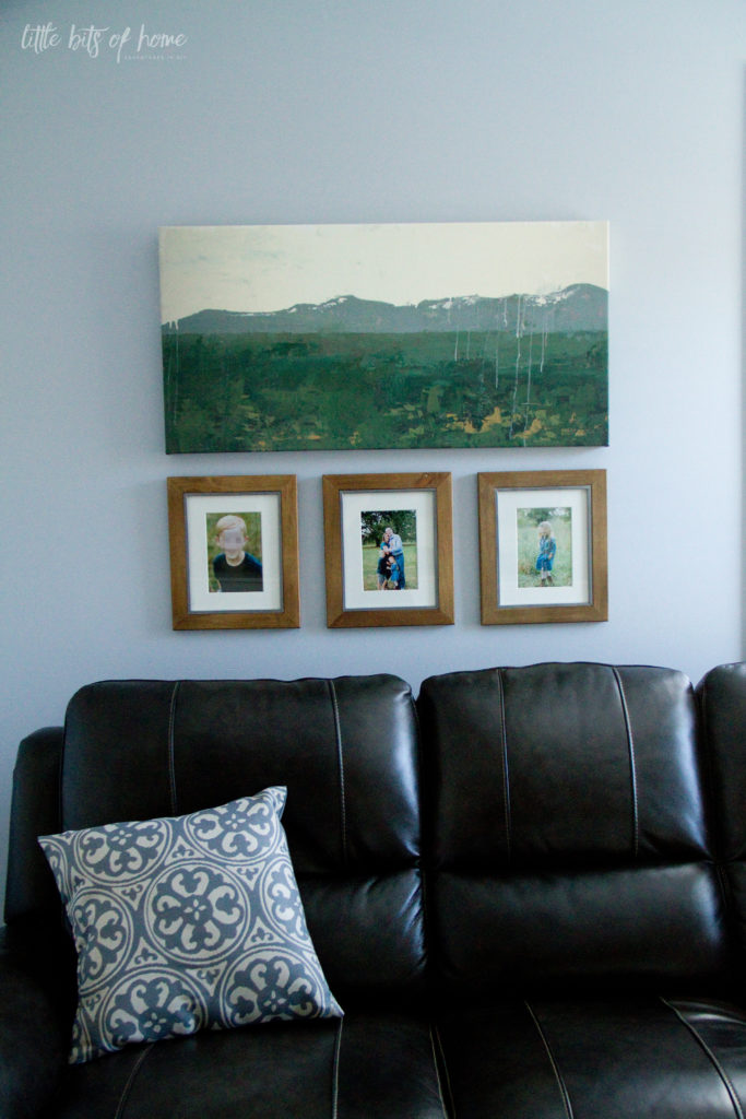
The frames are from Target and the pillows were a budget friendly Walmart score.
That’s a wrap! The playroom is so much more functional than it was before and went from a toy dumping ground to our favorite family hang out spot!
I’ll do a separate tour of the playroom organization soon. This post is already way too long! Haha! Have a great night, Friends!

Leave a Reply