This week is all about paint and sourcing artwork! I really wanted a spa-like light blue paint with green/gray undertones to compliment the shower curtain and rug I picked out. Here’s my mood board for the bathroom to refresh you memory of our bathroom plans.
If you remember, it took me 8 paint color samples to finally pick a color for our living room. I’m so indecisive! This time, I was determined to just make a decision and go with it. I pulled a bunch of paint swatches, looked at them in the room and held them up to the shower curtain and rug, and researched the colors online to see how they looked in a finished room. Then, I made my decision and bought my paint without painting a sample on the wall. Want to take a guess at how that worked out? Yeah, not so great. 🙁
I picked Benjamin Moore’s Ocean Air mixed in the cheap Glidden paint at Home Depot. I got all the cutting in done and stepped back to realize that it was not quite what I was going for. It was pretty, but kind of juvenile. I held up the swatch and the color was ever so slightly off. It was missing the gray undertones to tone it down a notch. Grrr.
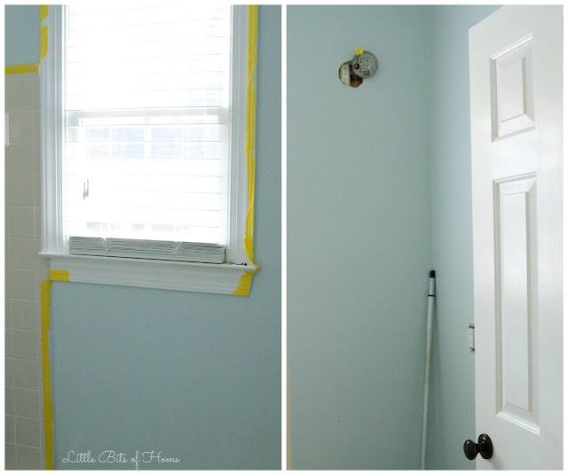
Home Depot would not let me return the paint even though it wasn’t exactly the same color as the swatch, but they did tweak it for me. I pulled some paint samples from my leftover living room sample palooza and tried them on the wall, then picked one that was closer to what I was going for in the bathroom. I took the sample to Home Depot and the man at the paint counter color matched it and figured out how much of each pigment it had in it, then used that information to tweak my paint color. It helped, but it’s still not exactly what I wanted. Now it’s missing the green undertones! But, I didn’t have the time, money, or energy to repaint with an entirely new color, so I went with it. Here’s a little peak!
*Side notes– While they were tweaking my paint color, they told me that Glidden paint has a tendency to not mix colors perfectly. I was not impressed with the inexpensive Glidden paint and won’t bother using it again. It was really thin in addition to the color mixing issue. Sherwin Williams and Behr (if I’m on a tight budget) are my go-to paints that never fail me, but I was trying to save money this time. #fail
Also, I just read this post by Meadow Lake Road on picking paint colors and thought she was spot on. Follow her advice, friends!
I also shopped around for a print to hang in the bathroom. I love the look of watercolor floral artwork mixed with pretty fonts and verses. I was having a hard time finding the perfect pairing of a verse I wanted plus watercolor that I loved.
Then, my friend posted an Instagram photo of 2 Timothy 4:17 and I knew instantly that it was exactly what I wanted. I decided to just make some artwork myself! I used her photo as inspiration for my text layout and purchased the same watercolor clipart featured in the artwork I included on my bathroom mood board. I’m no graphic designer, but I’m really happy with how it turned out and love the verse!
To thank you all for being such a great, encouraging group of readers, I’m offering you the print I made for free! Click here to download the PDF!
-Remove blinds and frost window.
-Decorate!
Now, full disclosure time… We are way ahead of schedule because this is our downstairs bathroom. We’re hosting a birthday party in a couple days for Little Man and kind of need a bathroom for our guests! Ya know, it’s the little things in life… Ha!
Be sure to check out the other projects over at Calling it Home! There is so much talent on display!
Linking up with Calling it Home, Savvy Southern Style, Remodelaholic, Thrifty Decor Chick, and many other awesome blogs!


We always use Behr or Sherwin Williams too and now I'm really scared to try Glidden! But the color looks great and you did a great job with the verse art!
I love this printable! Thank you for sharing it, I'm printing it now. 🙂 Good luck on your renovations!!
Isn't picking paint so frustrating, the same thing happened to me in our living room, the color was not the same as the chip, but I liked it enough to keep it. I can't wait to see more of your bathroom. Good luck!
Thanks for sharing at the Create-Share-Inspire link party. Come back soon!
I always think colors look so different once on the wall. Hard to tell from those little swatch colors. Even painting a small sample on the wall doesn't seem to be accurate at seeing what the whole room looks like covered in the color. I hope you're happy with the end result (even if it's a little off from your original vision). I think it looks great!
I love this printable. Thank you.
I'm totally digging this color, and I can't wait to see the end result!! Thank you so much for joining us at The Creative Circle Link Party, and see you next week 🙂
Paint is so hard to pick out. The lighting just changes the color from room to room.
I can't believe you had time to make that beautiful printable in the middle of this challenge. Thank you. 🙂