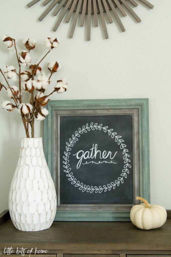
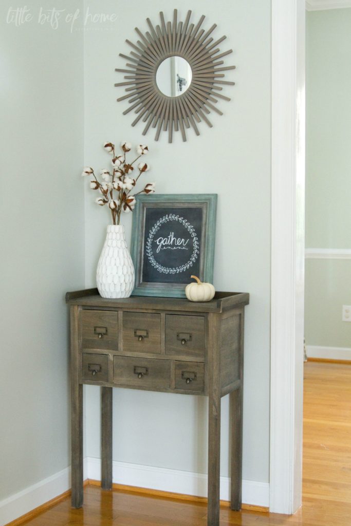
Let’s start with the entryway! I have wanted a chalkboard for literally years, but just never knew where to put one. I finally decided the entry table could use a chalkboard and made this one in under 10 minutes out of a frame from Home Goods and some chalkboard spray paint. Seriously kicking myself for not making one sooner!
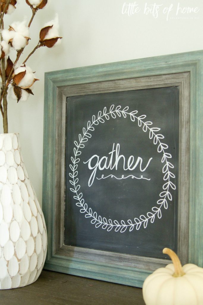
Don’t laugh at my meager attempts at chalkboard art. I have apparently not progressed past 2nd grade cursive. 😉
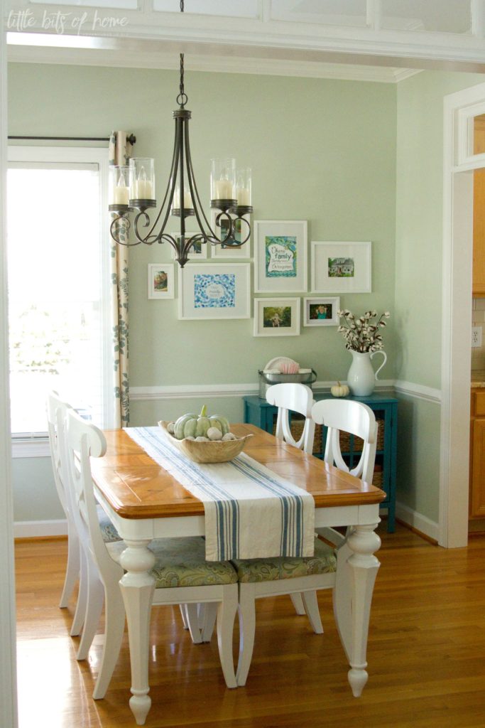
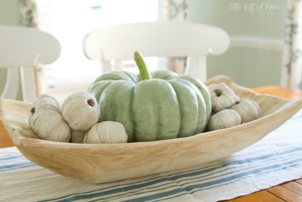
Turning toward the dining room, you’ll notice I kept things simple and relatively neutral in here. I love how white and blue pumpkins look combined with the blues, greens, and teals in the dining room!
Side note– I was planning to put the adorable jute pumpkin I made last year next to the white vase. It would’ve looked perfect there! But, I can’t find it anywhere! We tore apart our house for an hour searching for it today and it is gone. I just had it out this week! Sadly, we donated a bunch of stuff to the thrift store yesterday and I have a bad feeling it got put into the bags of donate items. Seriously, so sad! 🙁
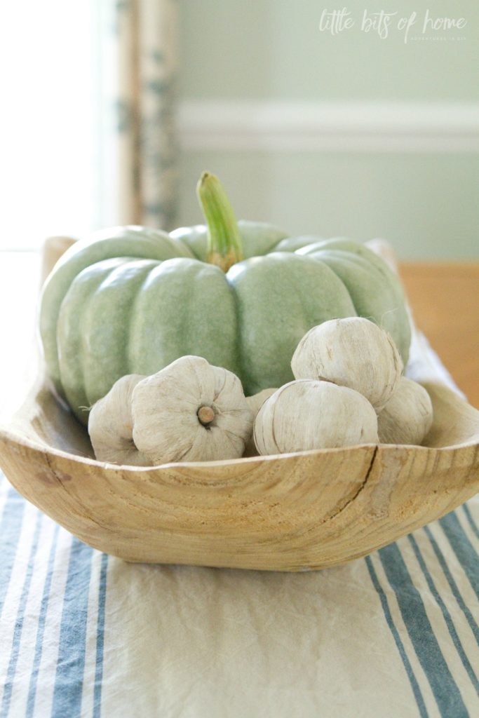
This bowl is my favorite thing ever in the fall! It is the perfect thing to fill with pumpkins! I scored the cute, white pumpkin filler at Home Goods this year. I love the little twigs as stems!
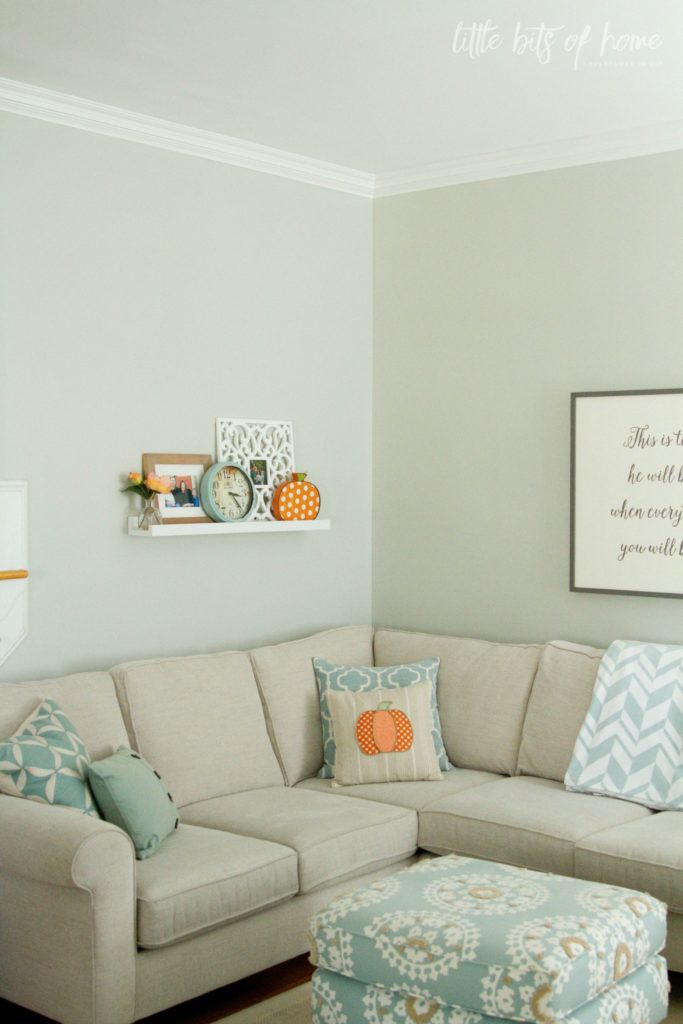
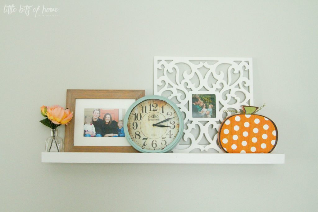
Heading into the living room, you’ll see I added lots of pops of orange this year! It brings such a happy, fun fall vibe to the room!
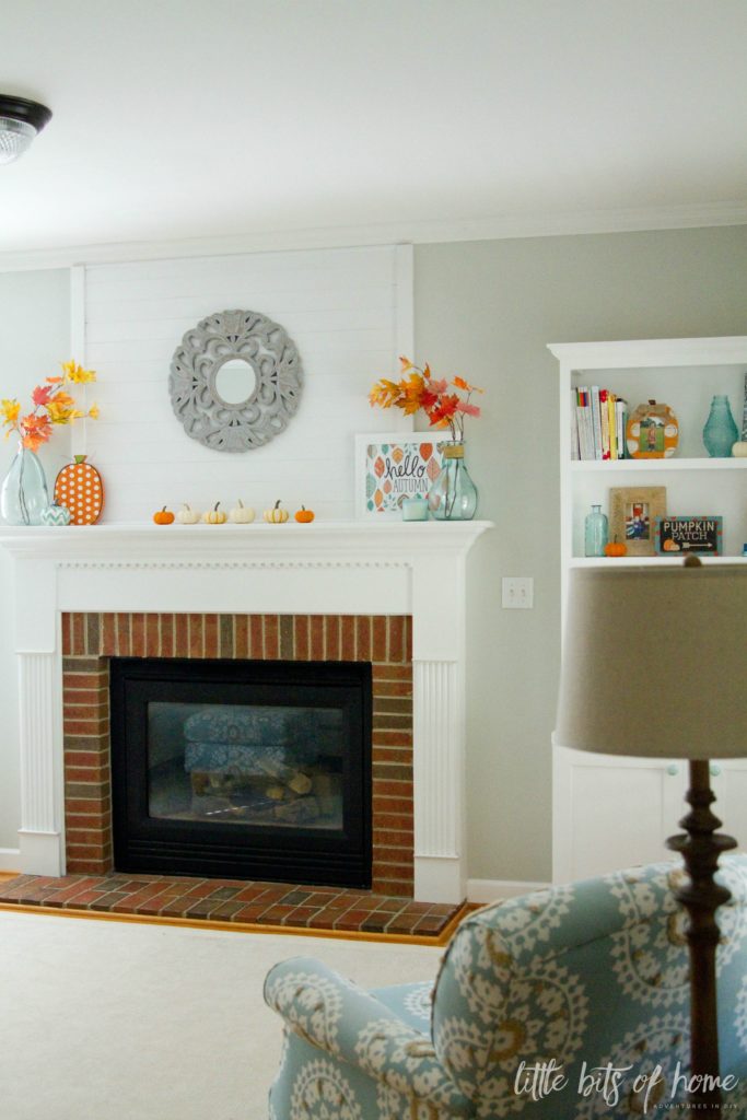
You can see my entire post about the fireplace and all the sources here, but I had to include a few pictures for the fall tour, too. 🙂
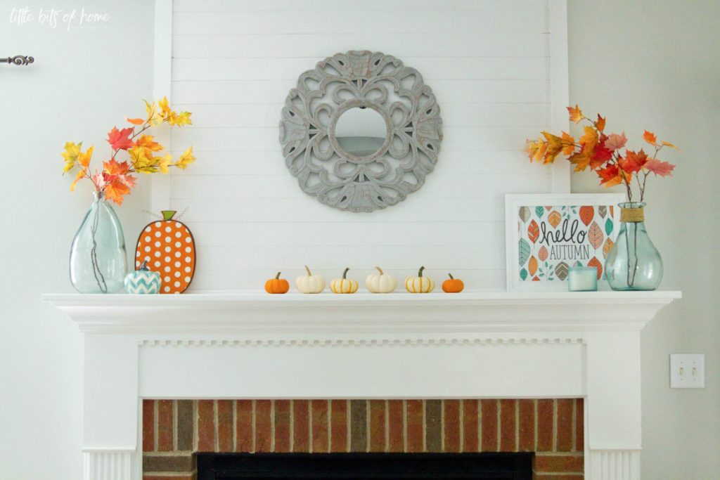
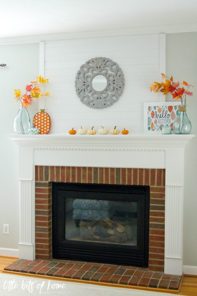
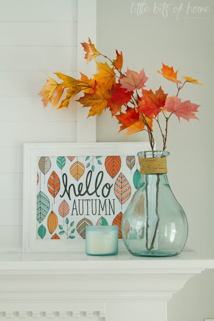
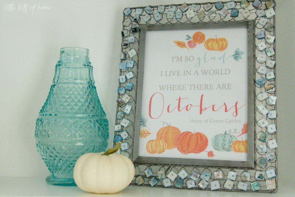
Have I mentioned how much I love this print from Pen and Paint?! It was the inspiration for my fall color scheme in here this year!
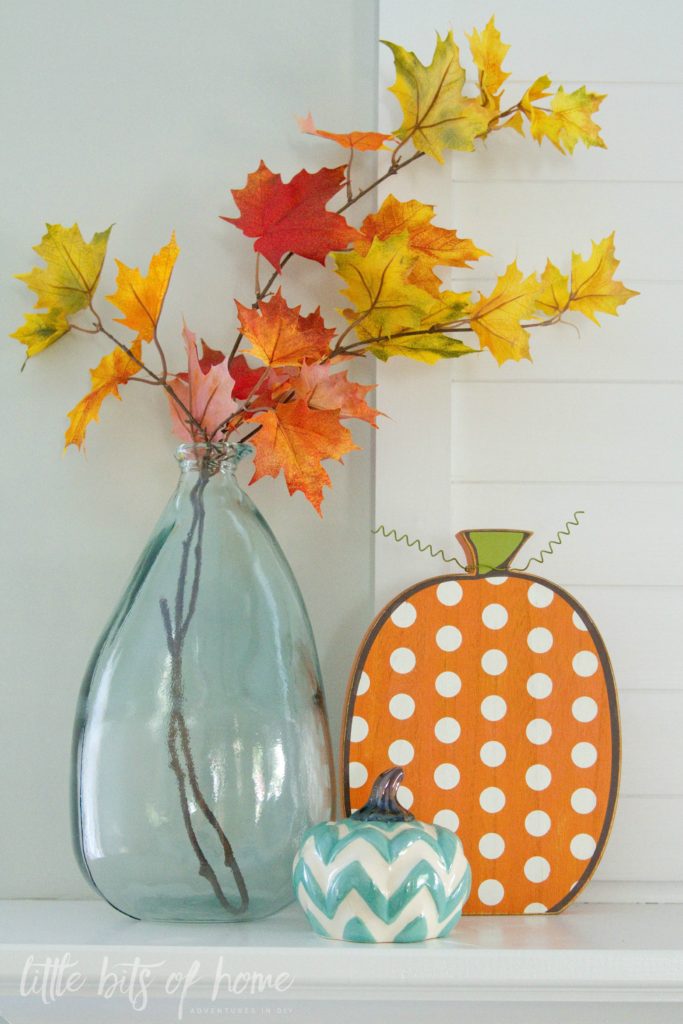
I just love these pumpkins from Kirkland’s!
I switched out a few things on the built-in to give it a fall touch. The built-in is still one of my very favorite things we have ever built! I say we but really he did the building. Ha! I designed, Jeremy built it, I finished and painted it, and we are both super proud of it!
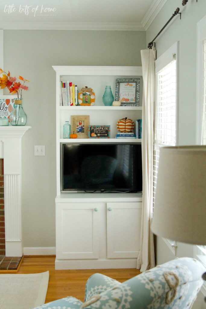
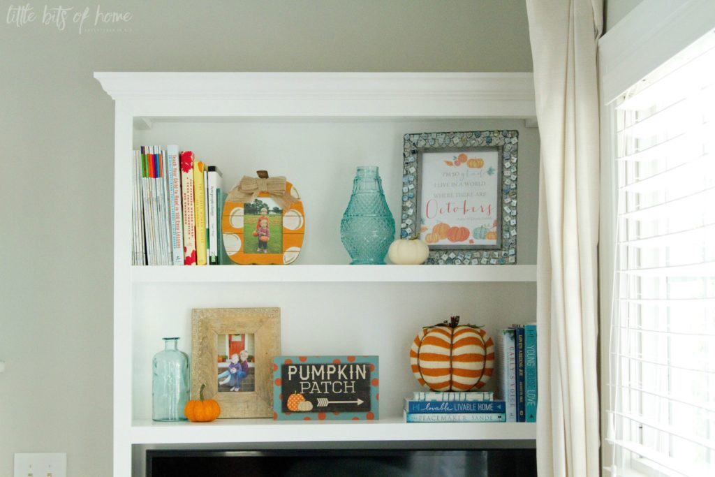
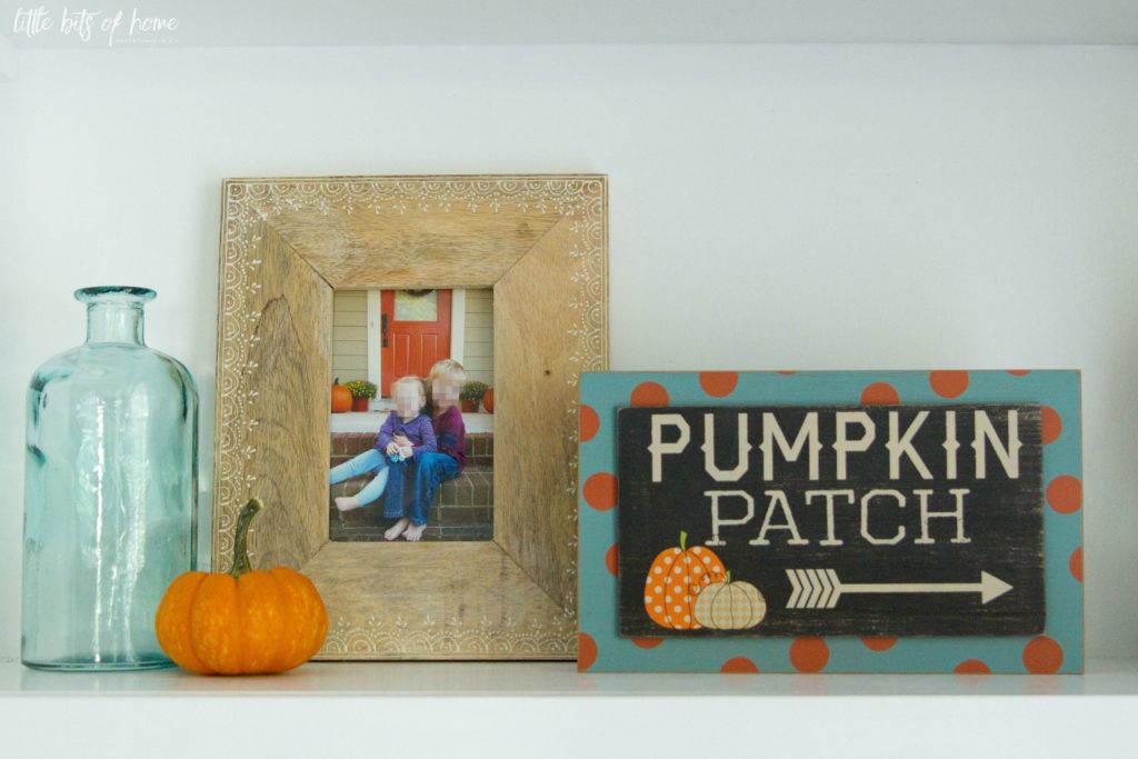
My friend Amy and I took a stroll through Kirkland’s before heading to the gym last month and I came home with so.much.stuff. It was all so cute and affordable! And, I had a gift card burning a hole in my pocket. The pumpkin frame, sign, and striped pumpkin are all from Kirkland’s! Seriously, Kirkland’s is killing it with their fall decor this year! Love!
I love this (free!!!) printable from Kayla Aimee! You can download one for your own home here!
On the other side of the living room, I have my DIY no-sew pumpkin pillow and another Kirkland’s pumpkin. Can’t stop, won’t stop.
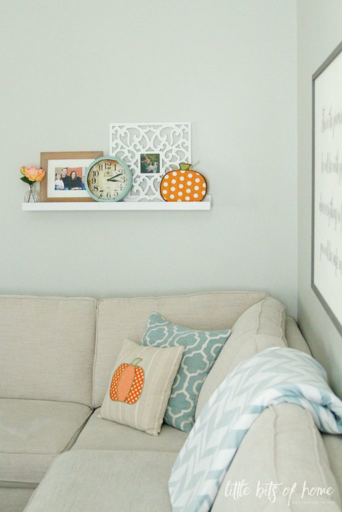
I love playing around with the decor on this DIY shelf we made!
Hope you enjoyed the tour! I’ll be doing an outdoor tour later this month! Ready for TONS more inspiration? Be sure to check out my blogging friends’ home tours below!

Monday
Tuesday
Wednesday
2 Bees in a Pod – Vicki’s house
Thursday
2 Bees in a Pod – Jenn’s house
Friday
Linking up with Thrifty Decor Chick and many other awesome bloggers!

Your home looks so pretty. I LOVE THE BEAUTIFUL BLUE COLORS!
Your home looks great all ready for fall! And your cursive doesn’t look like a 2nd graders, haha, i think we’re all afraid of writing on our chalkboards and then everyone else think it looks good anyway!
Hi Samantha!
I enjoyed checking out your tour. I believe i have that same chalkboard and it looks beautiful in your home (your chalk art is way better than mine). I need a wooden bowl like yours….the pumpkins look gorgeous sitting in it.
Much Love,
Erica
Designing vibes
Thanks so much, Erica! Chalkboards are so fun! By the way, I think the bowl may still be on Target.com!
I just love your mantel – the orange and teal are too perfect together! Lovely home and tour!
Thanks so much, Kim! I can’t believe it took me this long to think to put all my aqua decor next to some orange pumpkins!
Samantha – your home is beautiful. we love your use of turquoise – so very pretty! Your chalkboard is adorable – so worth the wait!
Thanks so much!!!
What a array of amazing fall projects, such a beautiful home tour! I love the bright colors of orange.
Great job and enjoyed it so much.. Maria
Thanks so much, friend! I *loved* your home tour!
Your home looks so beautiful! Love all of your fall decor!
Thanks so much, Amanda!
I absolutely love your mantel! Pinned!
You are so sweet! Thanks for sharing!
It looks great — I love how you incorporated a little bit of blue into your mantle. It was great hopping with you!! 🙂
Thanks so much, Heather!
the colors in your home are so beautiful! I love all the fall touches you’ve used. It is so warm and cozy.
Thanks so much, Amy!!
Love the mix of light blues with pops of orange Samantha! Your chalk board on your entryway table looks great and I love all those pumpkins and that printable.
Thanks so much, Tara! I’m still swooning over your fall mantels!
Samantha, everything looks so beautiful. I thought it was funny that you said your chalkboard art looks like 2nd grade cursive…I was wondering if it you even did it yourself because it looked so good!!!! I love the pop s of teal against the orange by the way – nice touch!
xo
Ha, you are the sweetest! 🙂 Thanks for stopping by! I absolutely loved your tour!
Adorable style! Totally swooning over that bowl of pumpkins!!!
Thanks, Sara! I looked for a dough bowl for forever at antique stores and they were all too pricey. Then, found this one at Target! Go figure, right?!
Samantha I loved your tour! the aqua and orange are SO beautiful! And I think your chalkboard lettering is lovely. 🙂
Thanks, Bre!!!
I’m over here giggling at “don’t laugh at my meager attempts at chalkboard art”. I have a chalkboard that I never write on because my cursive is stuck in 1st grade. I’m jealous of your mad skills! Really, your home is beautiful. I love the softness and simplicity of the white and blue pumpkins in your dining room – it’s just enough. And those splashes of orange in the living room.. such impact! I’ll be making a stop at Kirklands this weekend!
Haha! I was comparing my writing to all those fancy computer generated signs on Pinterest. We’ll just call our elementary cursive rustic and unique. Totally intentional, right?! 😉 Thanks for your kind comments and for stopping by!
Samantha, your home is so pretty and calming with fun pops of orange! I love it!
Thanks so much, Kathy!
So, so pretty! I am hoping to find some green pumpkins this year! Loved your tour!
Fun! I just saw some cool green “apple” pumpkins at the farmers market this morning! 🙂
I adore your fall color palette! The blue, greens, aqua & orange are fantastic together! You have such a pretty home Samantha!
SAMANTHA, YOUR HOME IS SO BEAUTIFUL! I LOVE YOUR CHALK ART AND YOUR MANTLE IS PERFECT! PINNING!
Thanks so much, Cat!!
sorry if I already commented- can’t find it! but I have to say I love the teal with the orange. so fun and bright. and the little “gather” vignette is so sweet. I commented on IG that I just love the dough bowl filled with pumpkins. so perfect!
Looks great! I love the colors you chose.
love your sweet lineup of pumpkins on the mantle! happy fall!
Samantha! I love your soft blue color palette and the pops of orange look fabulous with it!! Beautiful home tour!! – Rachael
Your fall home is so pretty Samantha, I love love love that bowl with all the pumpkins in it and all the beautiful orange fall touches everywhere! Happy fall!!
I love the teal and orange, It looks so great in your house! What is the name of the color that you used on your living room walls?
– Jaclyn
Thanks so much! It’s Benjamin Moore Gray Owl, mixed in our favorite Sherwin-Williams Harmony paint. Hope that helps! 🙂
Ahh!! I love all of this!! First off your 2nd grade cursive is adorable! Don’t sell yourself short! lol My favorite thing about your fall decor is it still stayed bright and cheery!! All too often you see the same dark colors, which are beautiful too, but it can all get so dark quickly!! Your space is still colorful yet bright! Love it!!
Beautiful tour samantha! I love the teal and orange color theme you have. It’s all beautifully styled!
You have a beautiful home and I love how you’ve decorated for fall! Love The pops of orange and teal, wonderful.
Thanks, Keri!