*Affiliate links noted in italics and provided for your convenience. For more info, see my full disclosure here.
Hey, Friends! Hope your holiday weekend was wonderful!
Today is finally the big master bedroom reveal! Yay! This post has been such a long time in the making and I’m so excited to finally get it up for you!
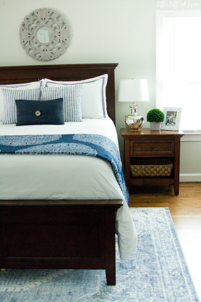
I’ve rarely shown our master bedroom on the blog. We purchased our bedroom set ten years ago when I was pregnant with Little Man and living in our old house. We added a new rust colored duvet and did a little decorating and called it done. We had purchased that house as a foreclosure and had a lot of other things to fix up and work on, so that was the last time our bedroom got any decorating attention, haha!
When we moved into this house, the master bedroom was yellow with a gold boob light in the middle. Now, add a rust colored duvet and what do you get? McDonald’s! Haha! I couldn’t take that for too long, so we painted the room Accessible Beige and changed out the light for a fan. Fast forward a few years and it still looked exactly the same. Same furniture and feeble attempts at decorations that we had transplanted from our old house. At this point, my decor style had completely changed and the rest of our house was light and airy, but this room remained dark and honestly, pretty drab. But, we were always too busy working on other areas to make time for the master bedroom. Feast your eyes on the only two “before” pics I could find, folks. 😉
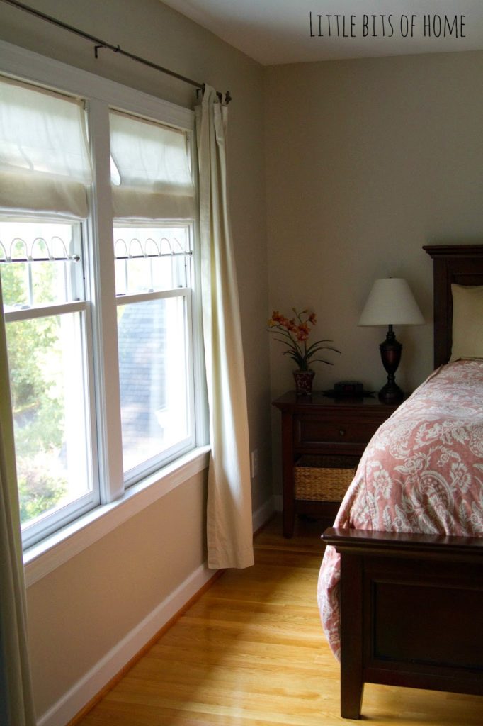
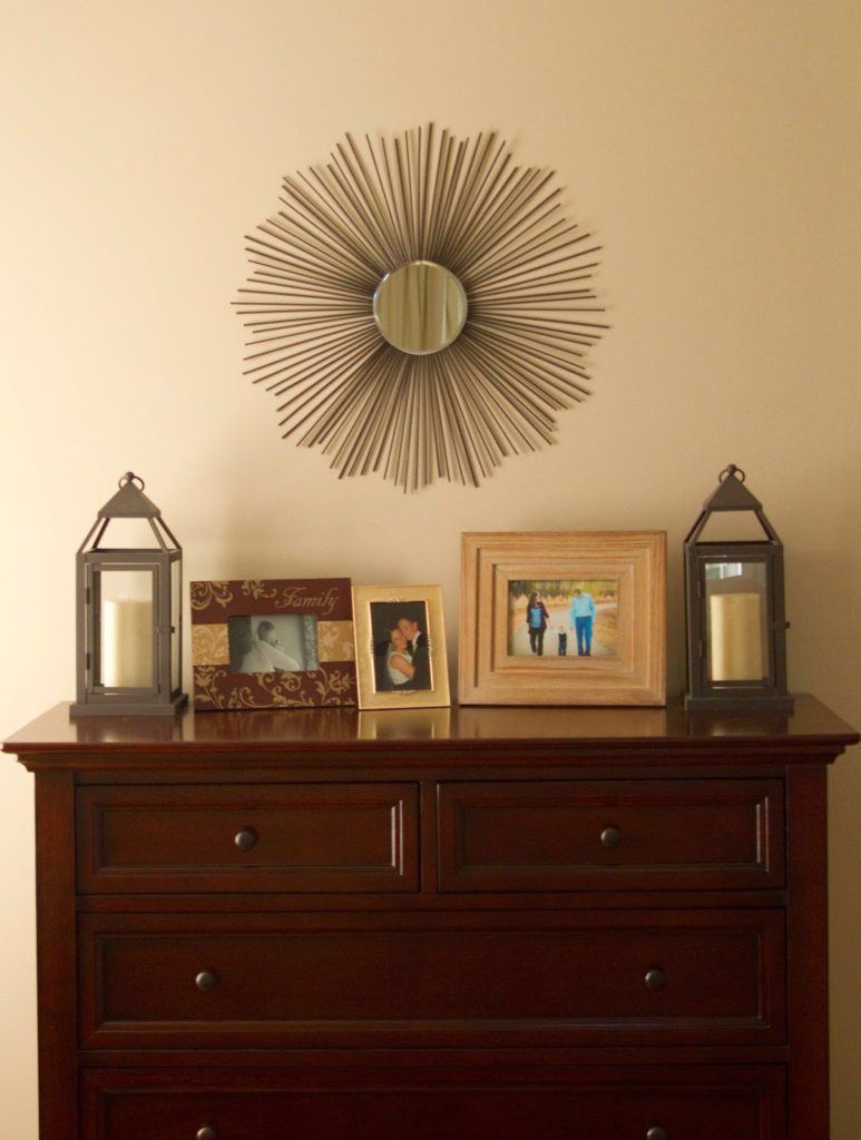
Fast forward again to when we were remodeling our master bathroom after we discovered a leak under the tub. That renovation started out great and then spiraled out of control. At the height of the renovation drama, I decided it was a great time to redo our master bedroom. Totally rational, I know. I think I just needed to have some order in the middle of the chaos. I painted the walls Gray Owl, hung new curtains and curtain rods, and purchased a new quilt. It felt so much brighter and was a much calmer space to retreat to at the end of the day.
However, the last couple of years, every time we start on a project, something big and important breaks in our house and interrupts the project and diverts the funds away. This time was no different. It is super frustrating, but the silver lining is that it allows me to let the room evolve over time which, often times, leads to a better end result. It took a couple years to slowly decorate and finish furnishing the room, but we really love the end result! C’mon in for a tour! All of the product sources will be listed at the bottom of the post!
You’ll notice right away that we kept the same bedroom set. We bought it at Haverty’s ten years ago and it’s still in excellent condition even after being moved three times. I have always liked the simple, clean lines in the set. I would probably pick a lighter wood if I were purchasing a new set today, but the dark wood is beautiful and timeless.
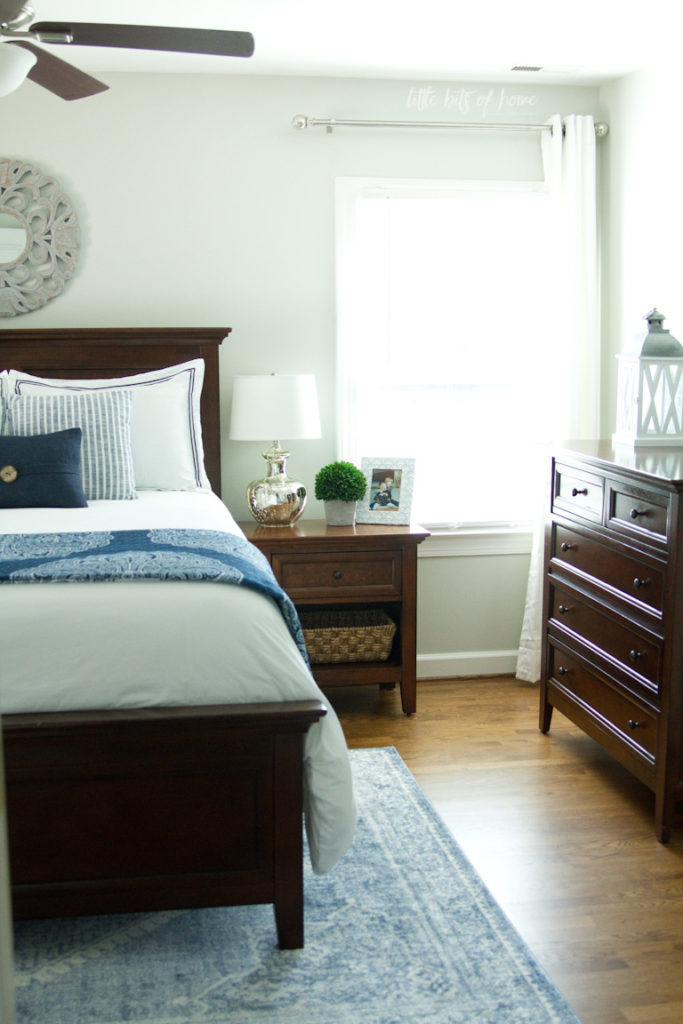
I had asked Jeremy if he had any opinions for the color scheme in here and all he said was, “Please no more sea glass, we don’t need it in every room.” Haha, so rude! 🙂 We both loved the navy in Little Man’s Star Wars room, so I decided a navy and white color scheme would be a good compromise. It’s not sea glass, but it’s still blue. I purchased a navy and white quilt from Overstock and that was our starting point for the room re-do. I paired the quilt with a white duvet to keep it from looking too dark.
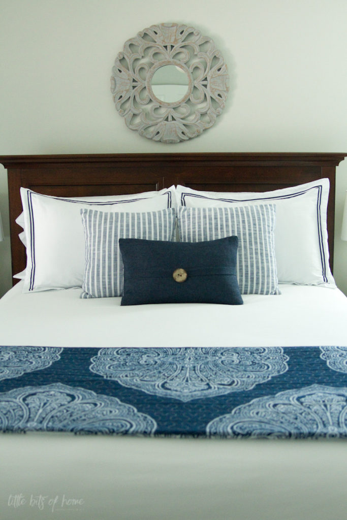
Do you recognize the mirror above the bed? It’s the mirror that hung over our fireplace for years! I had changed out the fireplace mirror for a larger size, but had never had the heart to get rid of this gray mirror because I loved it so much. I’m so glad I saved it and found a new use for it!
One other thing to note, you’ll notice several mercury glass touches in the room like the curtain rod finials and the lamps. You may remember from my Christmas home tours that I love mercury glass, so I was excited to find a way to sneak in mercury glass to our decor all year round.
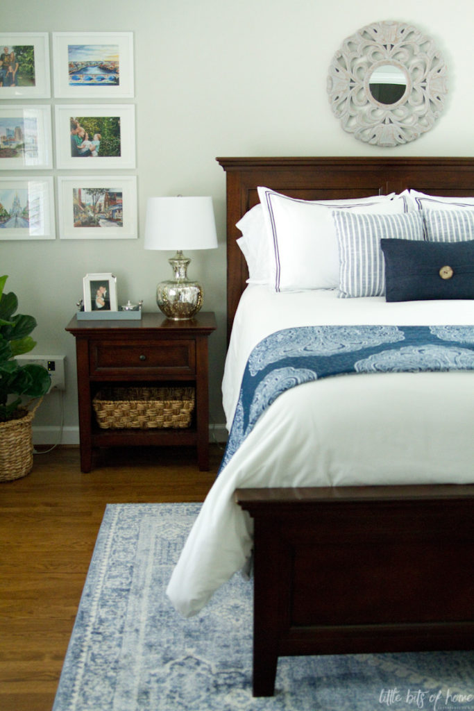
For some strange reason, the builder put a window on the right side of this main wall, but no window on the left side. No appreciation for symmetry, I tell ya! To give the room a sense of symmetry, I hung a grid of frames at the same height and width as the window on the other side of the wall. It tricks your eye into thinking everything is balanced.
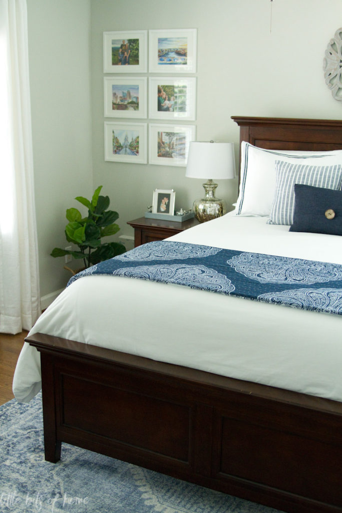
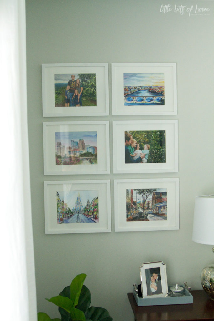
Inside the frames, I added some family pictures and artwork. Over the last couple of years, we have had a lot of fun collecting watercolor prints of some of our favorite places. We love looking at them and remembering special trips, people, and memories that those places represent.
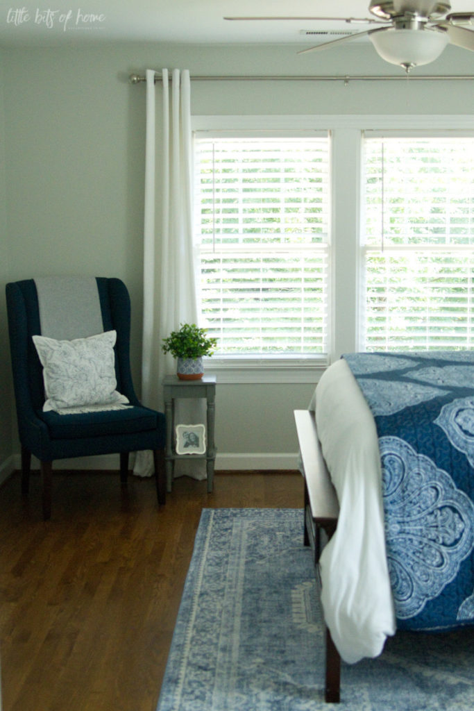
Turning to the left side of the room, you’ll see one of our biggest trouble spots. This corner looked too bare with nothing in it, but was too small for most furniture. We decided to add a small chair and end table and love how it turned out! Jeremy has always wanted a wingback chair, so this chair was a nice nod toward that.
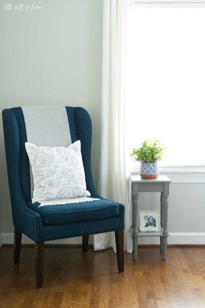
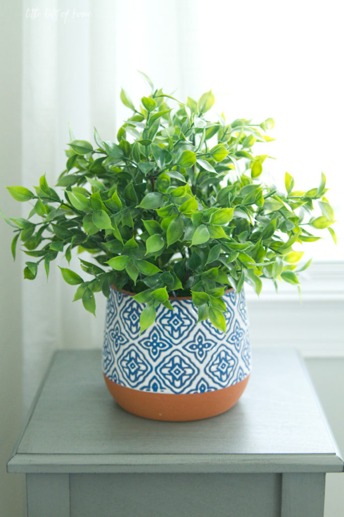
One of the most impactful things we added to the room was this rug. It was actually the very last thing we purchased and it really ties everything together with a big bow. I love how much it brightens up the room!
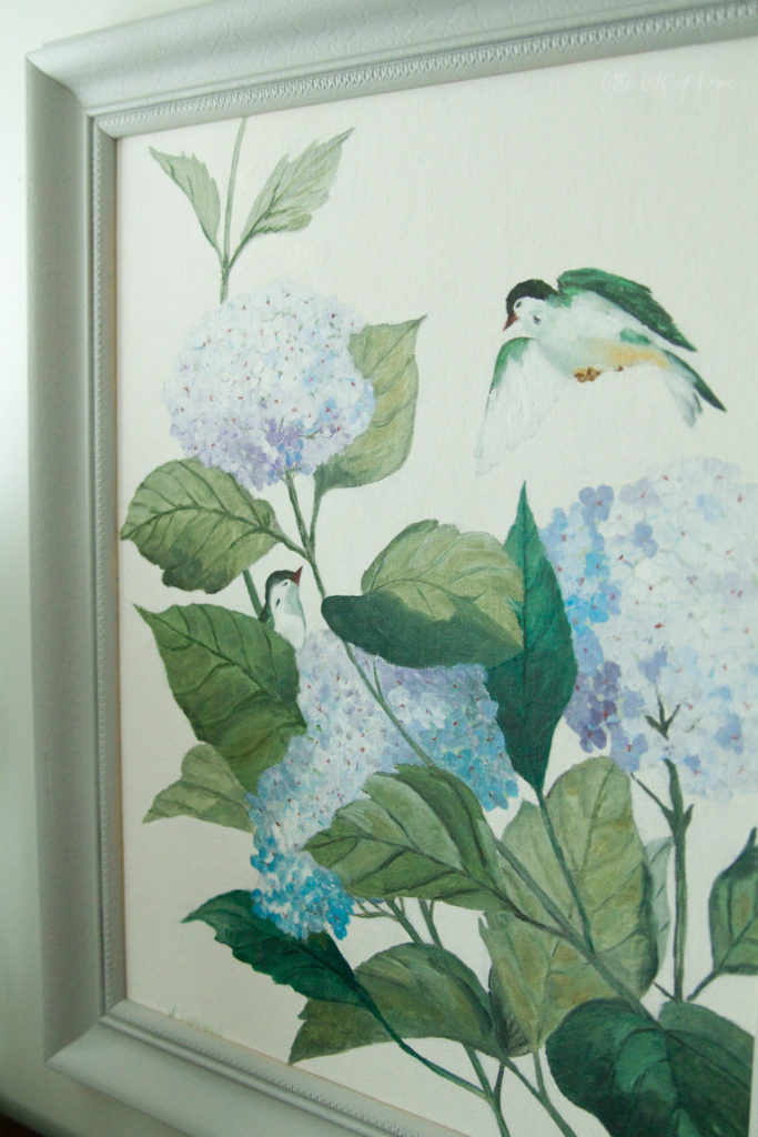
Over on the right side of the room, we anchored the dresser with one of my very favorite possessions, this painting I inherited that my grandpa did for my grandma. I planned to re-frame the painting and as I started to take the backing paper off, I found the sweetest treasure written on the back of the canvas. In my grandpa’s handwriting, it said, “Happy birthday, Anita (Everything Beautiful)” and was dated 1968. What a find! I totally bawled! And to think that note was hidden under the frame backing all these years!
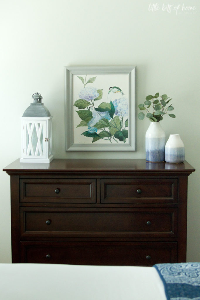
Isn’t it such a beautiful painting? I ended up painting the frame gray instead of re-framing it and am really happy with how it turned out! I love seeing this painting every day. It makes me so happy and makes me think of all the sweet times with my grandparents.
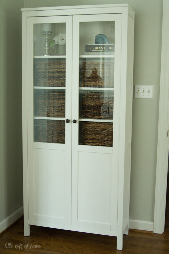
Finally, in the corner of the room between the bedroom and bathroom door, we added this cabinet for extra storage. We were planning to buy some type of tall, skinny dresser because we needed more storage, but couldn’t find a piece that went well with our matching bedroom set and were worried a dresser would stick out too far and make this walkway feel crowded.
We had purchased this cabinet to use as a linen closet for our bathroom, but after living with it in the bathroom, it felt too crowded. Inspiration struck and we dragged it into the bedroom and it just clicked! It’s not very deep, so it doesn’t take up a huge footprint, but the height adds a lot of storage. I was stuck on trying to match the bedroom furniture and never would have thought to buy something white for this spot, but it totally works and keeps everything from looking too dark! Happy accident!
The bottom two shelves hold overflow items from our linen closet and master bathroom and the baskets hold off season clothes.
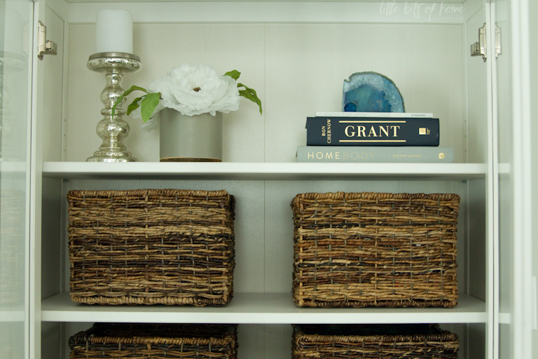
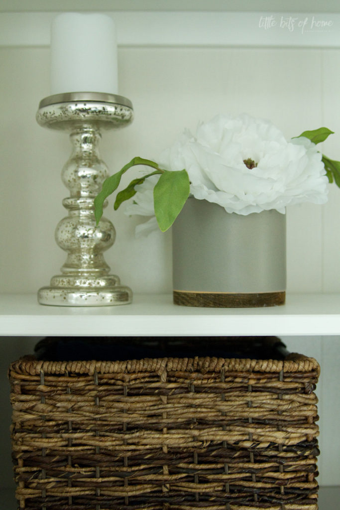
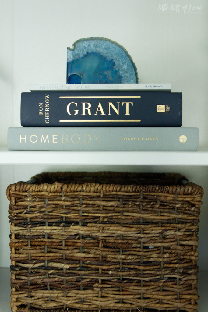
And, of course, I had to keep the top shelf clear for some decorations. 😉
So, that’s the grand tour! What do you think?

All of the sources are below! I linked as much as I could for you, but this room evolved over the course of four years, so I couldn’t find everything for you. When I could, I linked a similar item for you. Hope this helps!
Sources:
Navy Lumbar Pillow- Home Goods
Mirror- Home Goods
Gray Side Table- Marshalls
White Hemnes Cabinet- Ikea (similar here and here)
Mercury Glass Lamps- Target I have the large lamps, but could only find the small version to link, sorry!
Lamp Shades- Walmart
Mercury Glass Curtain Rods- Target (similar here)
Curtains- Bed Bath and Beyond
Fiddle Leaf Fig- Target I have the large tree, but could only find the small one to link, sorry!
Tree Basket- Home Goods
Nightstand Baskets- Home Goods
White Frames- Target (similar here)
Disney Print- Etsy
Nightstand Tray- Blog Post Here
Blue & White Vases- Target
Blue & White Planter- Kirkland’s
Mercury Glass Candle Holder- Home Goods

Leave a Reply