*Affiliate links noted in italics and provided for your convenience. For more info, see my full disclosure here.
Today is the day!!!! After sitting at 90% done for a long, long time, the master bathroom is finally completely finished and I’m so stinking excited to share it with you!!! It’s one of my very favorite rooms in the house!
But before we get too carried away with reveal pictures, I have to remind you what it looked like when we started. It wasn’t the most offensive bathroom in the world, but everything was original from 1997 and falling apart and crumbling. The grout in the shower was literally dissolving and there were cracks in the shower floor tiles. The cabinet doors were broken and falling off and the cultured countertops were super yellowed. And, I had forgotten until I pulled up this picture how short the cabinets used to be! Ah, 90’s builder grade… 😉
Honestly, it could have been worse. Growing up, we had an avocado green bathroom, so… Haha!
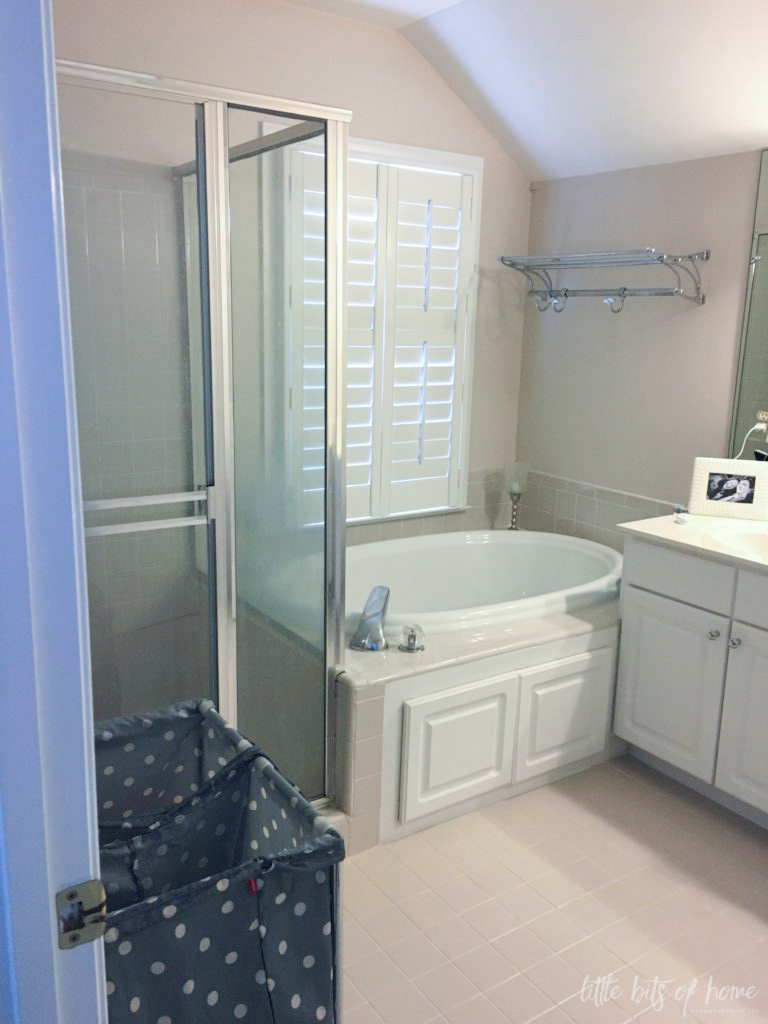
The only thing we did to this bathroom when we moved in was replace the vinyl pull down shade for a plantation shutter.
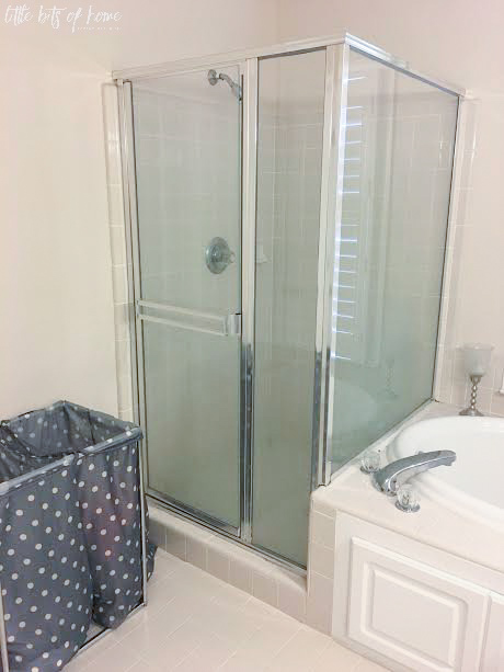
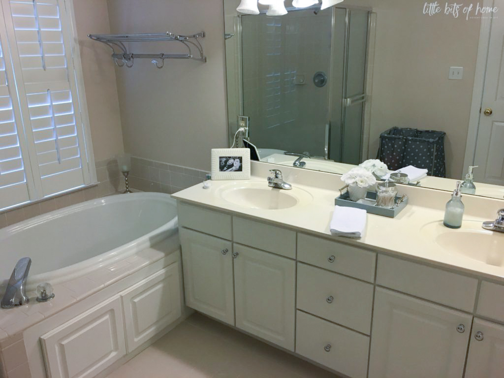
You may remember from this post, we started the bathroom remodel after we discovered a leak under the tub that was leaking into our living room below. Come to find out, the leak had probably been going for years. Ugh! It had rotted out the subfloors under the tub and shower. The subfloor under the tub and shower had to be ripped out and replaced. And, of course, because it was a “slow leak” insurance wouldn’t help. Sigh.
To save money and cut costs, we acted as our own general contractors and did as much of the finishing work as possible. We hired out all the demo, tiling, glass work, cabinets/counters, and electrical then installed all the plumbing fixtures, installed new baseboards, did the painting, shiplap, etc ourselves. Even with hiring out a big chunk, it was a lot of work!
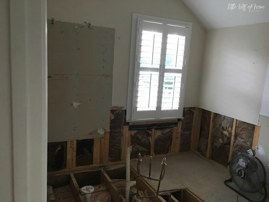
Now that those images are etched onto your brain… 🙂 How much better is this?!
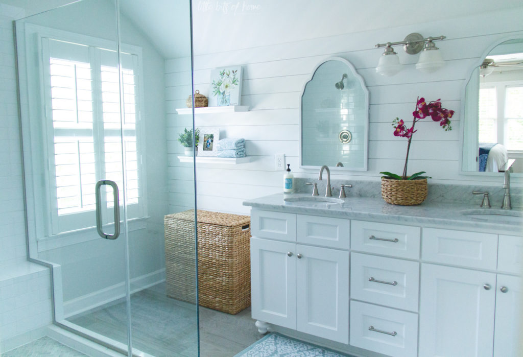
In case you haven’t gathered this yet, I’m stoked about how this room turned out! It’s so bright and clean and looks so much bigger!
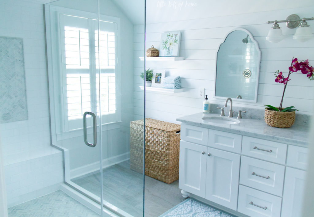
Let’s start with the shower area since that’s what started this whole remodel…
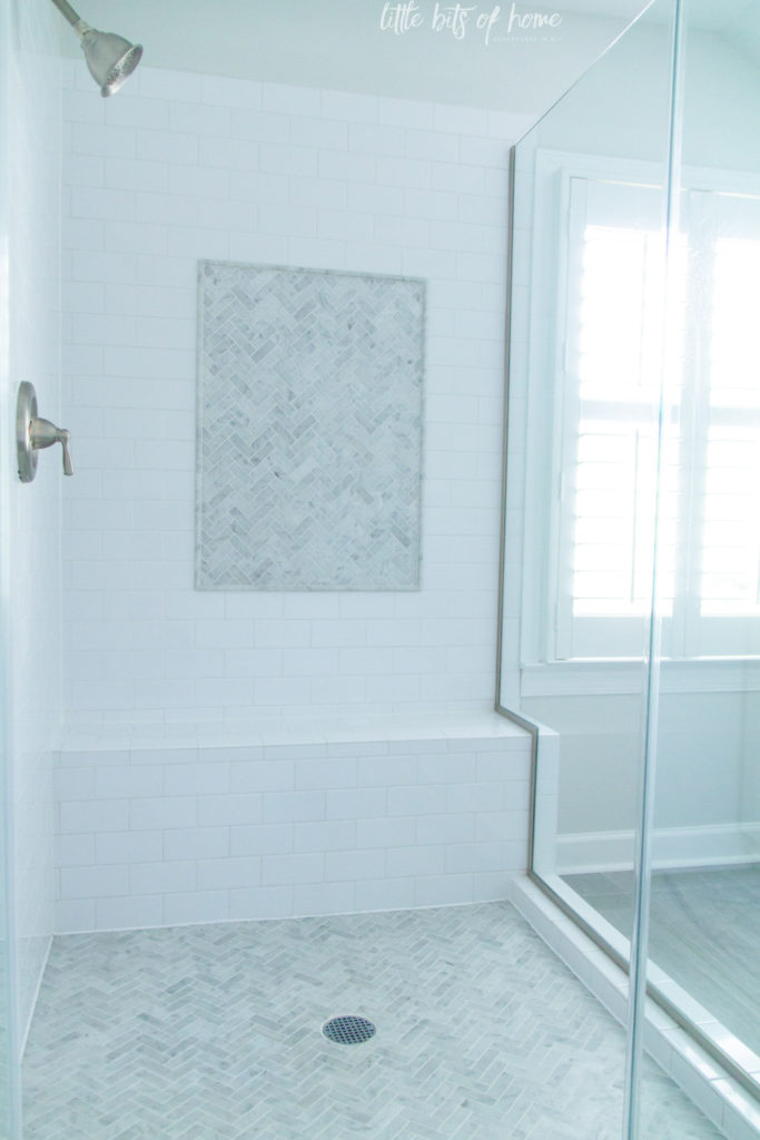
As you can see, we decided to permanently remove the bathtub. We are not bath people and I hated trying to clean that ginormous tub. It just collected dust and ate up a lot of space. We haven’t missed it a single time!
By removing the tub, we gained valuable space to expand the shower! We expanded the shower out and over a foot in each direction. With the expanded footprint, we were able to add a ledge/bench. Our previous shower had no ledge, so trying to prop my leg up while shaving was an acrobatic feat. I love the ledge!! Not only is it helpful for shaving, it’s the perfect spot to hold my giant bottles of shampoo and conditioner.
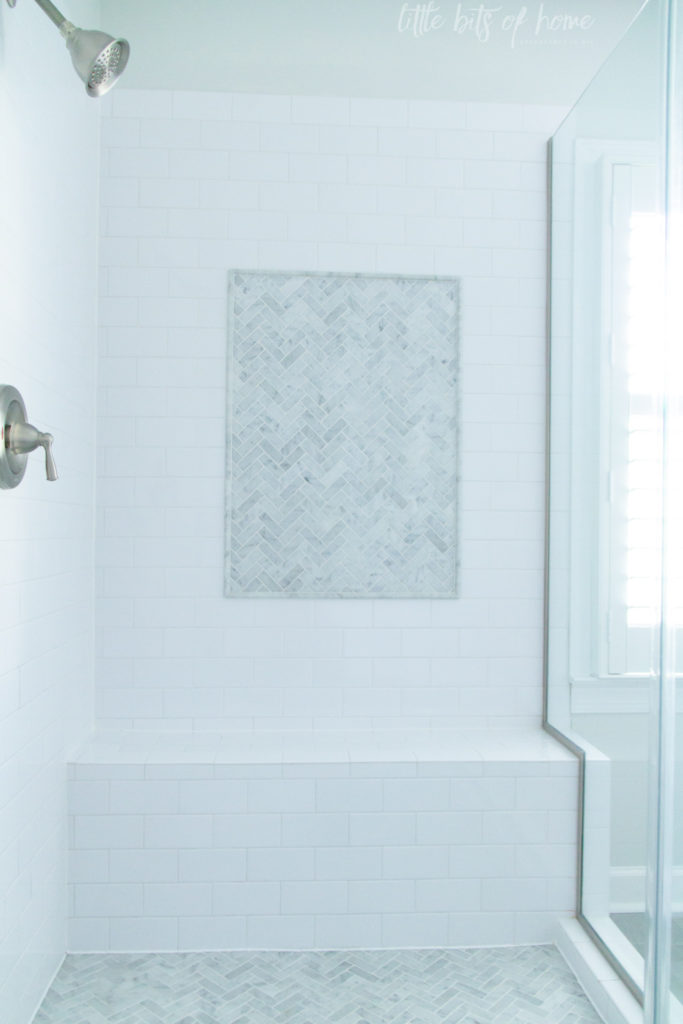
Now let’s talk about the tile. That marble herringbone tile gives me ALL the heart eyes. I seriously love it! I originally wanted the floor and the top couple feet of tile to be that marble, but boy was that expensive. Our tile contractor (who was AMAZING, btw) suggested this picture frame accent and we love it! It features the tile so beautifully and saved us a ton of money!
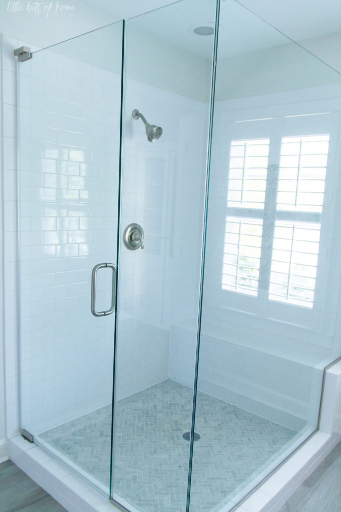
I was worried the shower would look like it took up the entire room with the expanded footprint, so went with frameless glass for the shower walls. I love that it doesn’t take up visual space and I love that there’s no tracks for grime to hide.
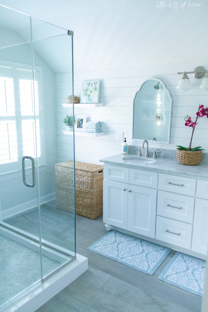
In the space where the tub was, we were able to add a big laundry hamper and some shelves for storage. We had originally planned an inset linen cabinet for this space, but the roofline is so steep behind the wall that it would have been strangely short. We tried a freestanding cabinet here, but it felt too bulky and cramped. I love where we ended up and the texture that the woven laundry hamper adds to the room.
And before we move on to the vanity area, we have to take a moment to talk about the floor tile!
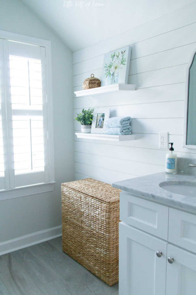
We both loved the idea of tile that looked like hardwood floors. I wanted them to be a warm wood tone, but when we got to the tile store, Jeremy fell in love with these gray wood toned tiles. If I’m being completely honest, I wasn’t 100% sold because I was worried the room would look too cold, but I had designed every other part of the room and felt like he should get what he wants on the one part he had a strong opinion about. So, I trusted him and went with it. And, guess what? I love it! He did a great job! High fives, Babe! 😉
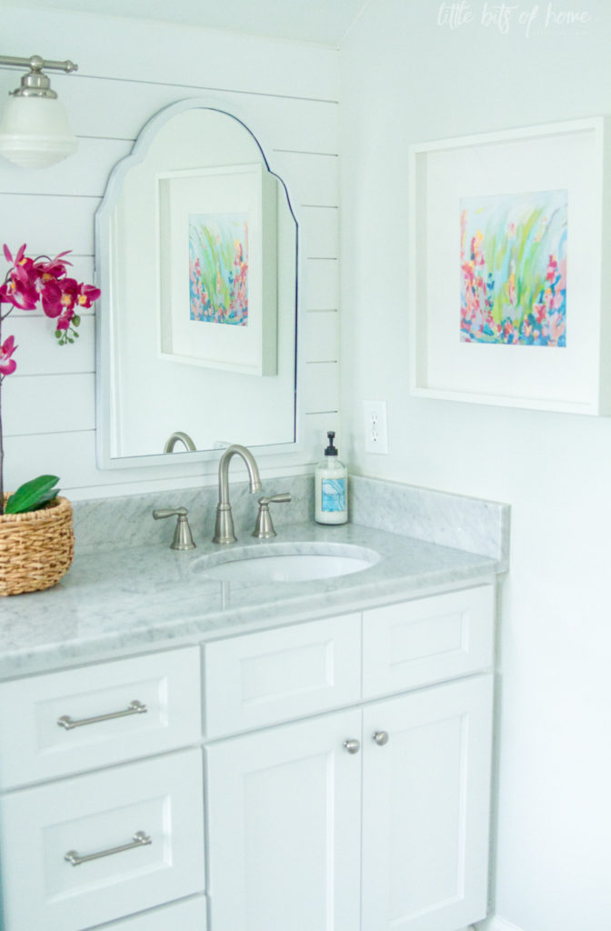
Now to the vanity wall! We worked with a local cabinet shop to get a cabinet the size we needed. The marble countertop was quite a fiasco and had to be redone a couple times. Third time was finally the charm. #stressful
I love, love, love the marble, though! I want it for our kitchen, but it’s simply too high maintenance for that space, so I put it here and enjoy it immensely.

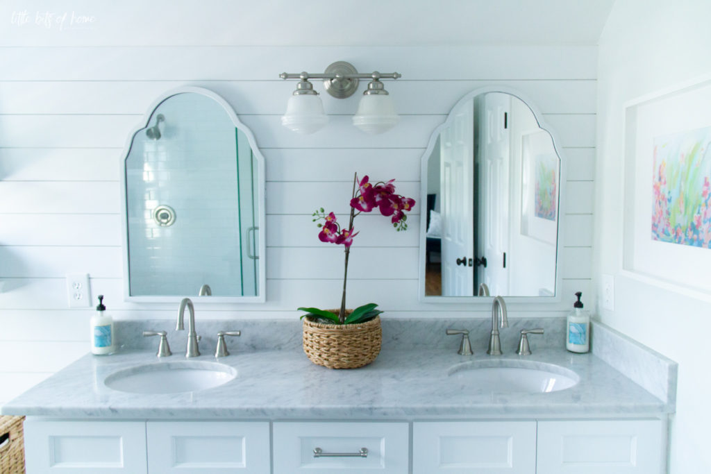
This vanity wall was feeling a little choppy and disjointed, so we added shiplap to tie it all together. I love it and it really helps everything relate to each other and feel more unified.
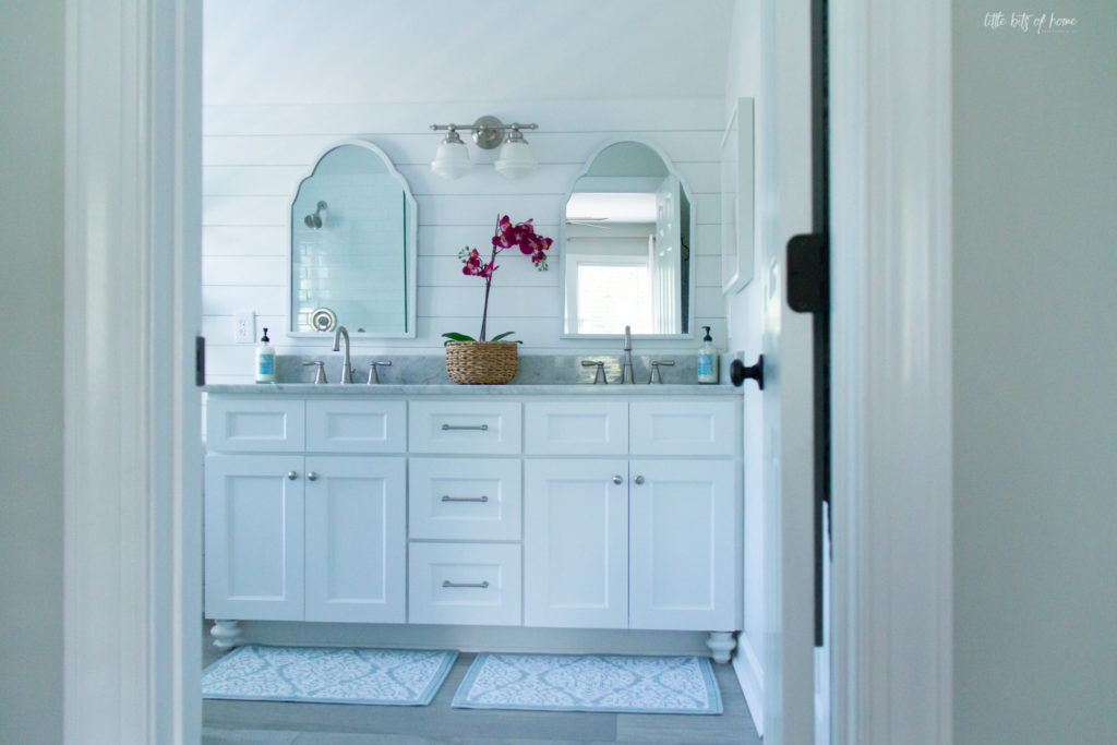
I admit, this is a weird shot, but it was the only way I could get the entire vanity into one picture. Ha! I just had to show you the feet we added to the cabinets to make them look more custom and like a piece of furniture. I found them at Home Depot and Jeremy added a 3″ dowel to the top to make them the correct height and then I painted them to match the cabinet. You wouldn’t think something that small would make such a big difference, but it really elevates the look of the cabinets!
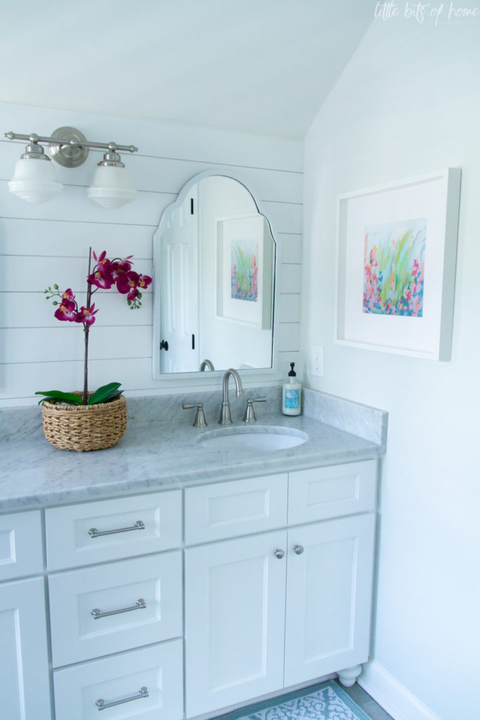
The arched mirrors make me swoon! They came in champagne, but I painted them white. I love the arched shape against the straight lines of the shiplap.
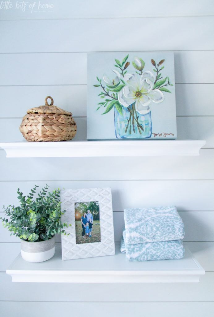
And, can we all just take a moment to appreciate this artwork? It’s a print from one of my favorite artists, Susan Skelley. I love her abstract florals so much and was thrilled to have one of her pieces in our house! It adds such a beautiful pop of color in here!
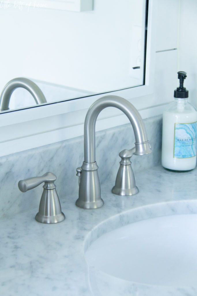
For all the plumbing fixtures, I loved the classic look of this widespread set. I really wanted one of those fancy long necked faucets with all the curves, but man were they pricey. This set was a happy middle ground with simple, classic lines.
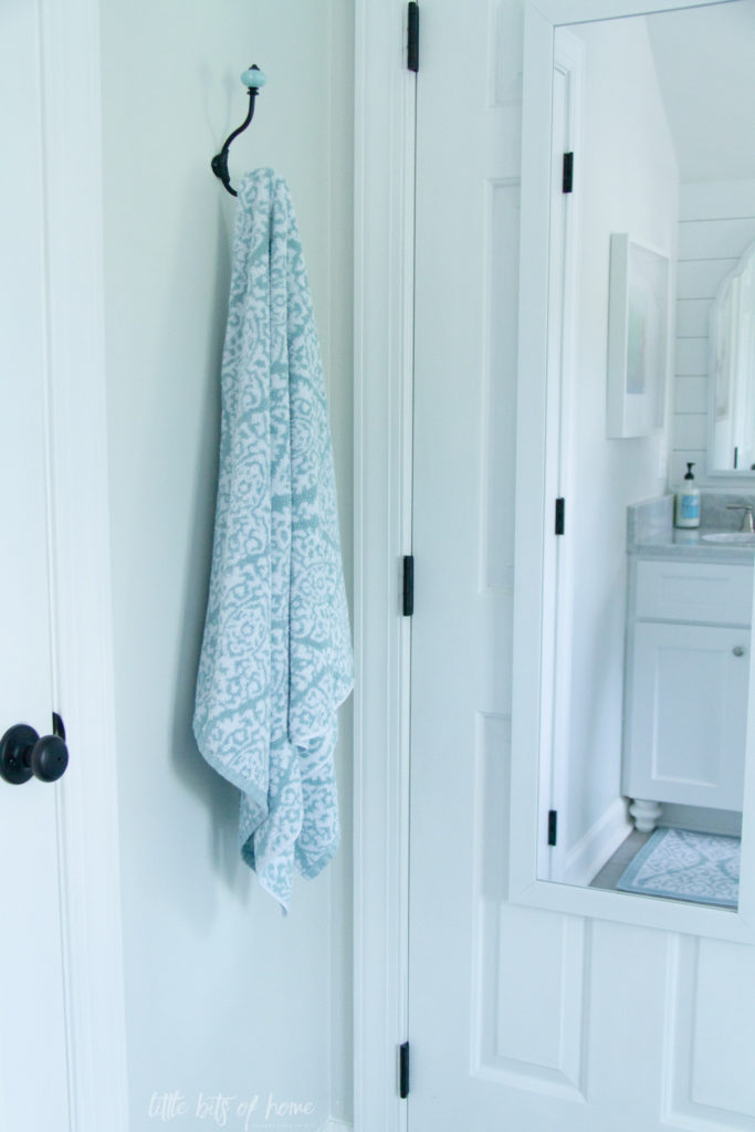
Ok, now to much less exciting but equally necessary things… The water closet corner. 😉 Right outside the water closet and opposite of the shower, we added this adorable hook to hang bath towels. I also added a full length mirror to the back of the bedroom door. The mirror was really intended for checking over my entire outfit, but let’s be honest, I end up standing two inches from the mirror to do my makeup. #gettingoldandblind #its2020iwearsweatsnow
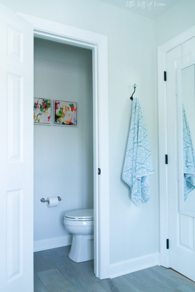
Inside the water closet, I added these canvas prints from Target. The frames were dark brown, so I just painted them white. They add a much needed pop of color!
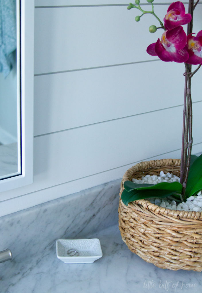
And for a glimpse into reality, a couple pictures with our stuff out. I love this teeny dish I found for only $1.99 at World Market and use next to the sink to hold my jewelry from the day.
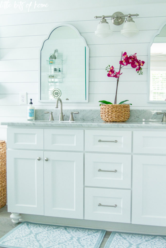
Can you spy all our bottles in the reflection in the mirror? We could have added a pony wall in the shower so we could have a shower niche for bottles, but I wanted the shower to be open and bright. Instead, we just keep our shower bottles on the ledge and in a small shower organizer. The extra light is worth it to me and I love not having to scrub the tile in a niche. 😉
I hope you loved the bathroom tour! All the sources will be listed below and linked if possible!
White Subway Tile (similar)
Honed Marble Herringbone Tile (similar)
Light- Shade of Light
Baskets- Target
Orchid- Ikea
Frame- Ikea
Plant- TJ Maxx
Frame- TJ Maxx
Canvas Magnolia Art- Kirklands

OMg. It’s so gorgeous!